Here is the criteria I adhered to:
- Use of the pdpa dropped petals texture
- Use of another texture in this case pdpa brown rice paper
- Collage/abstract
- Use of my own pics
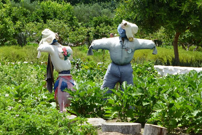
Here is my original photo:
Here is the result:
And here are all the layers:
With the hue/satuation layer, I switched on colorize and turned it a brown colour. The coloured cut-outs on top have varying opacities. The pdpa Brown Rice Paper texture has a Linear Light blend and the pdp Dropped Petal texture has an Overlay blend.


It looks fabulous. You did a wonderful job. Take care, Jen
ReplyDeleteWow, it looks so different from the original! Thanks for showing your process, too!
ReplyDeleteThis was well done! Your photo retained it's lightness as well as offered a great combination of texture
ReplyDeleteHugs
SUeAnn
wonderful combinations for the composite Farmyard
ReplyDeleteVery nice.
ReplyDeleteNice result!
ReplyDeletevery clever indeed!
ReplyDeletereally cool!! I thought it was "arm life" and then I saw the F, LOL!! it would have been apropos to call it "arm life" with those wonderful scarecrows and their arms!!!
ReplyDeleteit looks so simple on your recipe and I think I might have to wander back into PSE8 with a fresh mind. I keep thinking there is an only one right way there and I seem to undo EVERYthing. finally I get tired and say ENOUGH!!!
well, apparently there are many ways to play in PSE8 although I know only one and only one part of that as well!!
I have been using Pixlr and Picasa lately BEcause they are so versatile and simpler for ME to work with. the downfall is the lack of a "trail" as in PSE8.
oh well, I love this piece so VERY MUCH. it just makes me want to grin.
Super fun piece that really showcases "Farmlife" in a fun and abstract way. I love the added chickens and sunflowers to the piece.
ReplyDeleteThe background looks like bales of straw...who would have thought that texture could be changed that way. You presented all of us with a really bun abstract. You are super organized to be able to show in detail how you performed your magic. Hat off to you. smiles: sharon
ReplyDeleteI love country life and all the garden and hens and and and wink.. I love this --- I would hang in in my home...for a fall season feel.. and totally grateful to view the process...
ReplyDeleteHusg
Wonderful!!
ReplyDelete