Pages - Menu

Tuesday 18 December 2012

Building Transformation

From this:

to this:

or maybe this:

I will be demonstrating the technique of creating this picture in my next course which I will be starting in the new year.... Will be giving details soon.

Sunday 9 December 2012

Old vs New

While my husband and I were in Hong Kong one of our favourite visits was to the Nan Lian Gardens.  Here is a photo my husband took which is a real contrast of old and new.  To emphasis the contrast I converted the background to black and white.

I am about to create an photo album for a friend of mine and thought I would try out some of the options under the Guided section of PSE10.  By going to Photo Play, Picture Stack I changed the picture to this with just a couple of clicks:
It's well worth trying out the Guided options if you want some funky pages for an album.

Saturday 1 December 2012

Beetle in PSE

Okay, so I couldn't resist going away and changing my beetle in PSE.  Picasa is good for a quick fix but that's all.

Here are 4 variations.  I think I like the first but finding it difficult to decide....


More Picasa..

I don't always use my flash camera partly because I keep my point and click with me almost everywhere I go and it's often unexpected scenes that I get my best shots.

On my recent trip to Indonesia I took this picture of a ....hmmm...flying beetle(?) getting nectar from a gorgeous hanging flower tree.  I am really chuffed with this shot because it's not taken with a flash DSLR, just an ordinary camera.  Just love my little Panasonic....


So thought I would submit it to Photo Art Friday.  I gave it a quick change in Picasa which I am playing around with at the moment.  Sharpened the image slightly, cropped it and then applied a soft focus.

However, think a serious manipulation might be happening on this one sometime.....

Tuesday 27 November 2012

Picasa

One of the things I find when teaching Photoshop Elements is that for many people it is just too overwhelming and too feature rich.  After an intensive 2 day course, some users walk away dazed and almost unable to remember anything.  The majority of people on the street just want to be able to crop their photos, remove redeye and improve the lighting.

I am now looking at giving one day courses using Picasa which is really all that most people need to clean up their photos.  It's not good enough for serious photo manipulation but it's amazing how you can create some really fun versions of a photo that look very professional.

On our recent trip to Indonesia my husband took some wonderful pictures of dragonflies.  The photo I am using here is really sharp which is always my main criteria for producing good quality results.

Here is some variations using Picasa:
With this first version I went through the follow steps:
  1. Soft Focus under the first Image Processing tab.
  2. Cross Process under the second Image Processing tab.
  3. I cropped it using the photos current ratio (first tab).
  4. Finally I exported it by going to File>Export Picture to Folder..., reducing the size and adding a watermark.

With this version I:
  1. Added a Soft Focus under the first Image Processing tab.
  2. Then I applied a Focal B&W.
  3. Upped the saturation by going to Saturation.
  4. Finally cropped the photo and exported it with a watermark.

With this version I:
  1. Cropped the picture first using the photo's ratio.
  2. Applied a beige vignette Image Process.
  3. Finally I exported it and added a watermark.

With this final version I:
  1. Applied the Image Process HDR-ish.
  2. Cropped it using the photo's ration.
  3. Applied the Image Process Museum Matte.
  4. Finally exported it and added a watermark.

Not bad for a free piece of software!

Friday 9 November 2012

Lines

I see that the theme for this week at Photo Art Friday is 'lines' so I dug around in my photo library and came across this photo of a boat:
It was pretty boring so I thought this would be a great challenge.  Amongst other things, I added a couple of birds, changed the sky to reduce the contrast and added a wood-grain texture to give it an old vintage look:

Here's another attempt with a different blend:


Sunday 4 November 2012

Metal Clay Course

I've just had a fantastic day learning to use silver metal clay at the Surrey Jewellery School!  The course was given by Julie Holt who did a wonderful job of stressing the important details and tips when using metal clay.  She showed us both the kiln and blow touch methods of firing.

These are the pieces I came home with before I added a patina:

These are the pieces after adding a patina with the swallow in a bezel ready to add resin.

If silver wasn't so damned expensive this could be seriously addictive!

Friday 2 November 2012

Photo Art Friday

I'm on a roll with my silhouette method and decided to try it with the texture provided with the Photo Art Friday challenge and I really like the result. As in my previous post I added in the colour of the bird and the colour of the texture has given it another tint:

More Flowers

My husband has come back with another picture of his weekly work flowers and I thought I would try the 'silhouette' method on them (shown here).  This time I selected the flowers using the magic wand and put these on the top layer and reduced the opacity slightly so that they would stand out:

Go and see all the lovely flowers at Flower Art Friday.

Friday 26 October 2012

Shaded Silhouettes

I am creating a mini course on converting photographs to black and white and how you can use them in art and crafts or just as black and white photos.  Here's a taster of one of the techniques I will cover:

While I was creating a logo for a client's website, I quite by accident stumbled upon a way of creating a silhouette logo which was more than just black and white but also had another layer of shading.  I added a different coloured background to this and was really taken with the result.
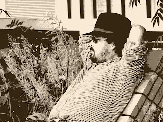
Here is an example:
I took this picture of a man on the 'High Line' in New York:

This picture works particularly well because there are lots of different values (shading) throughout the picture.  If there had been just darks and lights, it wouldn't have worked so well.

So here is how I did it.  The different levels of shading are created using the threshold filter and you can decide how many layers you want.  In this example I used 3 layers but you will be able to see how it looked with 2 layers.

  1. Open your photograph in PSE and copy the picture to 3 layers by pressing cntl+j (Mac cmd+j) 3 times.
  2. Switch off the top 2 layers by clicking the eye on the layers panel and select the first copy.
  3. Now go to the menu bar and select Filter>Adjustments>Threshold...
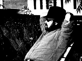
  4. Move the threshold so that it is fairly dark, press ok and rename the layer 'dark'.
  5. Here is my first layer:
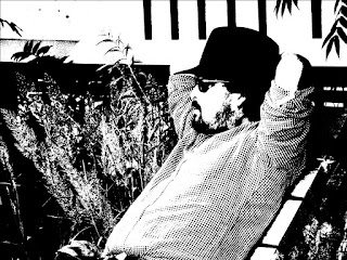
  6. Now turn on the second layer, go to Filter>Adjustments>Threshold... and set the threshold to neither light nor dark and call it 'middle':
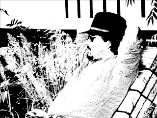
  7. Finally turn on the top layer, go to Filter>Adjustments>Threshold... and set the threshold to a lighter setting and call it 'light':
  8. Select the original bottom layer and press the new layer icon on the layers panel.  
  9. Choose a colour from the colour swatches panel and making sure the new blank layer is selected, press Alt+Backspace (Mac Option+Backspace) to fill the layer with the colour.  I used the colour #e0a84f.
  10. Switch off the top 2 layers again and change the opacity of the 'dark' layer to about 40% (you can play around with the opacity later).
  11. Switch on the 'middle' layer and change the opacity to about 45%. 
    This is what you get at this stage and you might not want another layer:
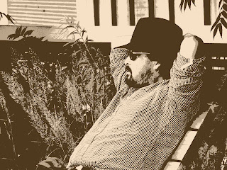
  12. Finally switch on the 'light' layer and change the opacity to 32%.  I've added the top picture again so that you can compare it with the two layer one:
What you might notice is that I removed the spots on the top left because they were distracting.  I combined all the layers first and then cleaned up the spots by brushing them with the colour that was around them.  The keystrokes to combine all layers to a new layer is Shift+Ctrl+Alt+E (Mac Shift+Cmd+Option+E)

Here is what your layers should look like:
You can go back and experiment with the opacity of the layers or change the background to another colour.  If you decide not to have a coloured background just keep the opacity of the 'dark' layer to 100%.

Old Beetle Car

Some years back my husband and I played golf on the island of Cozumel in Mexico and I was delighted by this old beetle car which had been converted into a ball retriever on their practice ground.  Well, of course, a photo like this just has to be aged, doesn't it.  So I decided to submit this to Photo Art Friday for the theme 'derelict':

Thursday 18 October 2012

Smoky Quartz Necklace Improved

As a person new to jewellery design, a surprise to me has been the usefulness of photographing your jewellery and then looking at it again.  When I first designed this piece it looked fine but as soon as I photographed it, the flaws became more apparent.  After seeing the photograph it was clear that all the rows of smoky quartz were too dominant, that it needed to be broken up with a lighter more delicate bead and one that matched the crystal drop.  In my mind this now looks a lot better.  The ends are still a bit 'top heavy' but a lot of that goes around the back so is not obvious.  However, maybe when I put it on and photograph the back I might want something less strong.  This has been such fun!

Wednesday 17 October 2012

Smoky Quartz Necklace

Sitting in front of the TV at night I often wish I had something to do while I watch and I so enjoyed putting the last piece of jewellery together in front of the TV that I did another one.  I bought a string of Smoky Quartz beads sometime back and recently found a brooch that I could use as a focal point so I have been itching to put a necklace together as I wear a fair amount of brown and this would be a super piece to wear in the evening.  I intend to make it longer and improve the connection to the crystal drop but wanted to see what it looked like so far.  Will probably intersperse some clear glass beads amongst the quartz.  Have to go out and find some pretty clasps.  Yet another piece without a clasp!


Monday 15 October 2012

Vintage Jewellery Creation

As well as photo manipulation, one of my other interests (well, another one of my MANY interests) is jewellery making. Last year I did a fantastic online course with Deryn Mentock and created a necklace for my sister and I've been dying to do something for myself but haven't got around to it.  Finally, I sat down and created the necklace that I wanted for a special occasion coming up soon.  I just need to get a nice clasp for it otherwise here it is:

Saturday 13 October 2012

More Flowers

My husband has come home with the new flowers for the week:

So after many layers and much blending this is what I have:


Tuesday 9 October 2012

Trying to Prove my Own Theory Wrong

It really does make a difference if your picture is sharp to start off with. I have quite a few pictures that are really not very good but have some value in terms of content. What I want to try and see is if it is possible to make something of a picture even if it isn't good.

I took some underwater pictures with a camera in an underwater case but the camera got so steamed up that I could only take a couple of pictures before the whole thing was too cloudy.  This picture was taken in not great snorkelling conditions as you can see by all the bits in the water but I never really got any decent pictures so I wanted to see if I could do something with this one:

Well, it is obviously much better but not as good as it could have been if it had been sharper:

Monday 8 October 2012

Challenging Myself

I have lots of photos in my library which I like but which are really not up to scratch.  My husband took this photo of waxwings in Mexico:
They weren't close, the light was fairly tricky and the whole branch was swaying in the wind but I love the way they are all pointing in the same direction and in such a big group.

Could I take this photo and make anything of it??

Whenever I transform a picture like this, I ask myself about the result 'would I put that on my wall?'.  I think I would.  It's quite funky.  I'm not sure about the background but the wonderful thing about Photoshop Elements is that I can change that at anytime.

Saturday 6 October 2012

Playing with Flowers

My husband's company has beautiful flower arrangements in their lobby each week and I have asked him to start photographing them for me each week.  The best pictures he took were slightly blurred so I opted for this one and wondered how I could make them really stand out.  In the end I went totally different:

Wednesday 3 October 2012

New Manipulations

I'm always on the hunt for new ways of manipulating pictures and at the moment I am particularly interested in doing something with buildings which are never easy to improve or make spectacular.  While I was making a silhouette figure for a website I stumbled across a new way of manipulating pictures.

Here is the original picture taken of Provincetown in Cape Cod and changes :
It's always interesting to me that what works for one picture doesn't necessarily work for another and I was interested to see whether my new method worked for a completely different picture.  I was quite pleased with the results.


One thing clear to me whenever I do any manipulations is that, unless you are doing a drastic manipulation, the sharper the picture the better the result.